Music Broadside + Image
Graphic Design — Typography
Overview
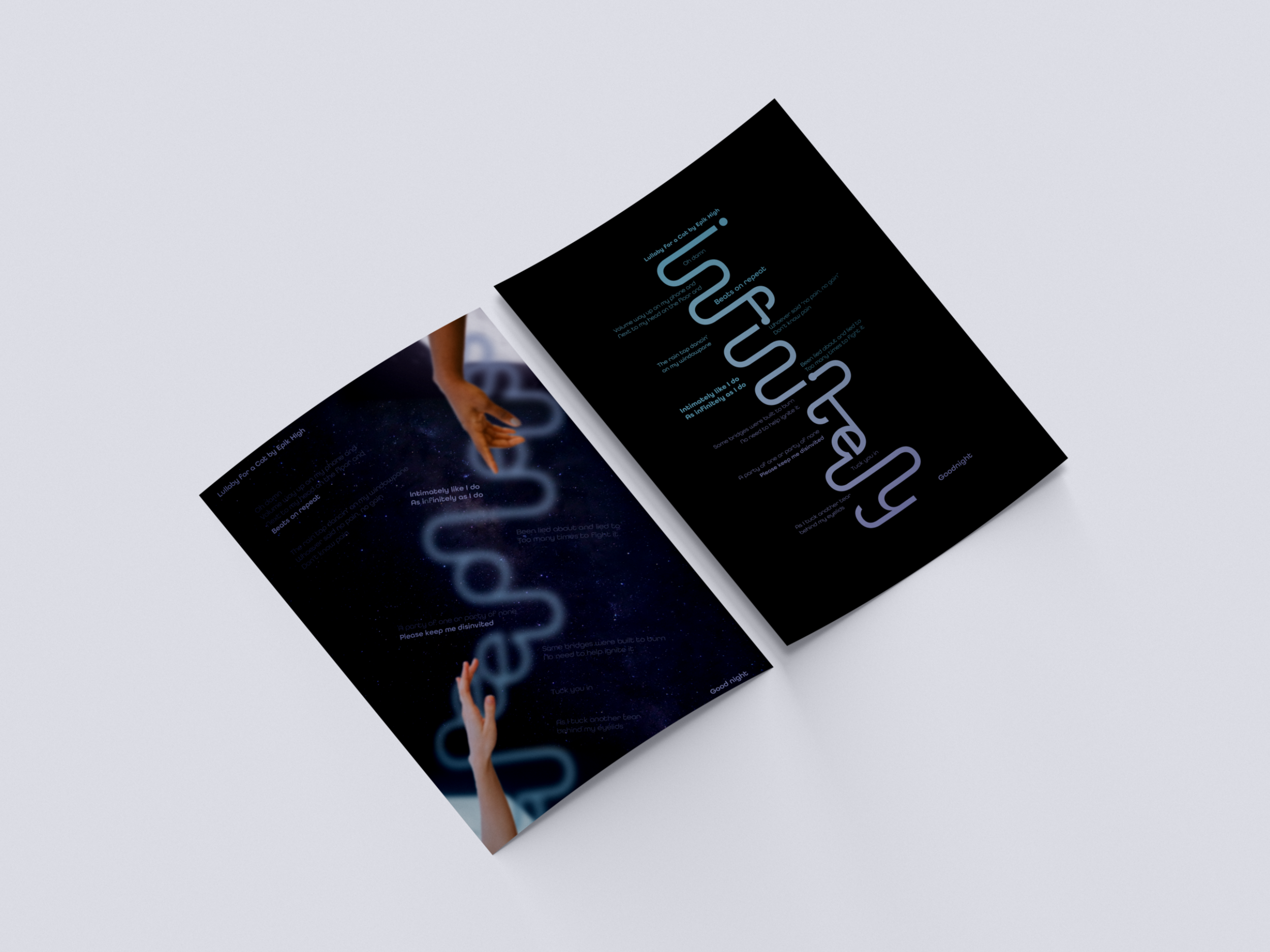
The objective of this project was to bring our interpretation of lyrics from a song of our choice and create two broadside posters that resonate with that interpretation. Students were to create two Post Modern Grids systems developed from the flow on the logotype inspired by the song's meaning, as well as an image of choice that follows the mood. In order to communicate a meaningful visual representation of the song chosen developing a concept, and focusing on typographic treatments, colors, and images should enhance our layouts.
Song Selection + Interpretation
The song I chose was Lullaby for a Cat by Epik High. Lullaby for a Cat speaks for the moments when we would lay restless on their bed. We are consumed by our overthinking and strange thoughts about each and every moment that occurred during the day. I envision someone looking over at the base of their feet, where there would be a small cat sleeping soundly, giving them comfort but making them yearn for an identical peaceful rest.
“Oh damn
Volume way up on my phone and
Next to my head on the floor and
Beats on repeat
The rain tap dancin' on my windowpane
Whoever said no pain, no gain
Don't know pain
Intimately like I do
As infinitely as I do
Been lied about and lied to
Too many times to fight it
Some bridges were built to burn
No need to help ignite it
A party of one or party of none
Please keep me disinvited
Tuck you in
As I tuck another tear behind my eyelids
Good night”
Logo Type Process + Sketches + Explorations
The key operative words chosen to resonated with the song were Sleepless, Restless, Uneasy, and Infinitely. Focusing on infinitely; meaning to an infinite extent; without limit, an exploration of possible logotypes led to settling with the typographic treatment of connecting each letter to give an illusion of the type having no end. After further developing to logotype, the next step was to seek for images to derive a color palette that resonated with the operative word.
After receiving feedback, I further refined my logotype. In the process, I developed a Post Modern Grid from the logotype itself, which led to working with guidelines, font-weight, and deciding on a color to develop a layout that communicates the essence of the song. During this process, I wanted to step away from a traditional layout with a small logotype and the lyrics following a basic grid from it. I then explored a new layout with the logotype on a larger scale and created a Post Modern Grid that followed the curves and lines.
Logotype Refinement Process
TYPE + IMAGE PROCESS + SKETCHES + EXPLORATIONS
After developing the Logotype Layout, the next step was to develop a Type + Image layout that would make a pair with it. Thinking about the concept of the song, an image of a bedroom set with light shining in was what inspired the images to the right. From there, more three Post Modern Grids, for the three photos, were created and I explored where the text would be laid by following the grid lines.
After applying the text to the grid layouts, the layouts felt bland. The layouts were struggling with the full bled images as the text felt like it was not one with the layout. The legibility of the text was suffering, especially when applying color. This led to an idea of collaging images of a galaxy, the dark bedroom, arms reaching for each other, and another logotype with the word sleepless. This idea was more experimental; it helped create a dynamic layout and a way to integrate the text better.
FINAL APPLICATIONS
Spring 2021 — Adobe PhotoShop — Adobe Illustrator


